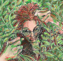
Here's a study in what doesn't work. Though there are some beautiful things about these two pieces, they're not really working, and I finally put my finger on why: it's because I am undecided about some very basic questions. Is it painterly or linear? Undecided. It is realistic or decorative? Undecided. Is it flat or does it have depth? Undecided. So no matter what I did to try to unify the different parts and different techniques, they're schizophrenic.
I have this idea in my head, and these are trying to get at that. I just need to make some decisions. I have way too many inspirations at the moment, and there's so many things I want to try, but I can't do them all at once.
So I'm going to keep working on these (not these particular pieces, which I have declared done, as unsatisfactory as they are, but this idea).


I still think they look awesome and I like the backgrounds too!!
ReplyDeletexxx Marianne
Very strong and powerful, and certainly realistic against abstract backgrounds. The background of the second one looks like a shoal of fish. Interesting. I really like them.
ReplyDeleteI think they are great! I like the line stroke on the 1st one, it reminds me of Van Gogh meets The Scream. The second one is very interesting. I know how it is hard to have a vision and it doesn't come out the same on paper. I don't know what your vision was....so I think they are great!
ReplyDeleteYes, I like them because they express an idea. They are very interesting. I know what you mean about too many ideas at once. Sometimes there are too many and sometimes none at all.
ReplyDeleteWow these are so cool and a little spooky!
ReplyDelete