
So...it is my INTENTION to make art. Please please please let me make time to make art. I WILL.
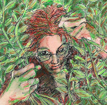
And here's another portrait to add to my collection of portraits that don't look like the people who are being portrayed, and another picture to add to my collection of pictures I don't like very much. My son and I were just talking about it, and how you have to make the pictures you DON'T like in order to get to the pictures you DO like. I suppose, though, that if one were self-reflective about the ones that one doesn't like that one might move to the ones one does like faster.
But anyway. It is what it is. I never did find my jug of India ink. I think it was a quart jug, and there just aren't that many places a quart jug of ink can hide. So I ordered another one, and it came, and I must say that it pleases me no end to use real pens again, ones that you dip in the ink and that have flexible nibs so that one can vary one's lines, and also make long lines.
nice line quality!
ReplyDeleteThis is nice! You might not think it looks like the person it is intended to look like but that fact does not affect its value as art. The technique looks pretty great to me. I bet you can name a couple things about it that you actually like.
ReplyDeleteOn the other hand, I generally complain about my entries as well (and people scold me in the comments, as they probably should.) ;)
I totally agree with you about using the pens and ink. I have located my pens...but not the ink...yet ;) Fab drawing, as usual !!
DeleteI absolutely love this! Yet another piece I could look at all day - so much to take in, detail, textures, especially love the expression on his face. There is nothing I don't like about this - fantastic! :)
ReplyDeleteYou may not like this, but I certainly do..a lot!
ReplyDeleteNice job! I think sometimes art we make that doesn't please us as much often does please someone else, so we should just keep making things. I do like this one :)
ReplyDeleteVery well done.. Such character and treat to see.
ReplyDeleteWell I like it! This old Nordic-fest guy has some personality. Really nice contrasts, as always.
ReplyDeleteThis is amazing inkwork!
ReplyDeleteA bit of self-criticism doesn't hurt though, it only makes us improve.
It's a lovely drawing, so expressive! I make almost all my pictures striving to get a bit closer to one I like, it very rarely happens! If I only posted paintings I liked my blog would be very dull and very empty! ;o)
ReplyDeleteJess xx
Hya :) Well it's strange when you don't like some work and other people do like it. You have to ask: is it me who has no taste - or is it them? What a choice!
ReplyDeleteWhat I like about this is, as always , the vigour, but I also like the contrast of the whiteness of the face and the darkness of the shadow - and it's weird, cause the shadow is kind of metaphyiscal, there's something swirling there...
I have been painting cwap for the last six months - and I have a show coming up in a few months - and nothing but old work ......................argh :)
Maybe we can swap muses? I like yours better!
OK, this is AMAZING. I love how you combined different textures, and it totally works. The platters adds interest and seemed to have landed in just the right places. How amazing is that?
ReplyDelete