
In both of these, the light yellow is too light, and basically doesn't contribute anything to the overall pictures.

And this one, I didn't like the dark that I started out with, so I only printed five of those, and for the rest, I carved a way a little more, and used a redder ink. I'm much happier with it this way.
I think they are awesome!!
ReplyDeletecolor, though! Wonderful! I love the way you've essentially used stippling in that second one.
ReplyDeleteThanks! That was deliberate (a miracle in and of itself)!
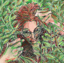
DeleteI think your first painting is like a Chagall, certainly as good as his in my (humble) opinion. For me the light yellow in both paintings is just right, particularly in the first one. I am always interested in the way you analyse your work, and when you have made your adjustments the pieces do always look better. Lovely powerful work.
ReplyDelete