
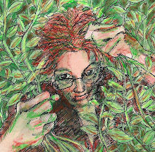
I think I'm getting the process down. In this last one, I was going to stop after the dark green layer, because it looked really really cool with just the two greens, but I carved away for the black, and was going to print just one, to see what it looked like, and I'm really glad I did, because the black adds a lot of depth.

This one, my next-to-last one, I'm not so happy with. The red seems just TOO shocking. I'd almost like to do this design again, with some other colors, and also carving more texture into it. Maybe I will. I thought I was done with these, but maybe I'm not.....
They both look wonderful to me. Annette x
ReplyDeletehttp://nettysartadventures.blogspot.co.uk/
Really gorgeous! Still needing your address so I can swap some art with you. Its ready to head your way - Marji
ReplyDeletemarji@marjisart (dot) com
Greetings , I was just the other day looking at some old children's books illustrations admiring the technique wondering how they did it. Now I know :) Wonderful how you do so many different things ! Oh I like the red muchly. Red is going out on a limb and it says something precisly - blood anguish anger look at me etc. It's the opposite of safe beige eh ? :)hope you are well
ReplyDeleteThe old lady with the worried forgetful look is wonderful, and yes the darker green adds so much. Her hands are a wonderful study in themselves.
ReplyDeleteThe red print is so powerful, and as Andrew says fullof emotion and anger. I also love the minor detail of the way you have shown the eyebrows.
Yes, indeed, it *would* seem you're getting the process down. The are both stunning. And I see what mean about the red in the second one, but it also make for a very bold and expressive image.
ReplyDeleteMerry creating!