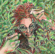
 Sometimes when the pressures of life get too great, all I want to do is wrap up in a soft warm blanket and withdraw from the world for awhile.
...uh....the color sure came out bright in this. It's way brighter than the original. I ought to be able to tone it down, but how?
Hya Theresa,
ReplyDeleteHa, my favourite inner expression is stop the train I want to get off!!!!!
The software usuallu comes with a saturation and hue control.
Best thing to do is take your image, copy it into a new layer then play with the saturation. Then click the layer visbibilty on and off to see what you have achieved.
You also probbaly have a desaturation tool which you can reduce the saturation by painting with it.
What software are you using?
PS thanks for the comment on my blog. The work I do is like taking pics, so its not actually drawing, so what you get in the final image is sometimes a surprise. As you noticed. When I get a chance I'll cut and paste some stuff over the offending areas and reload the image I think.
cheers
I like this very much. The colors are really good and convey the whole mood :) Thank you for your kind comment... It's probably neither here nor there but I believe I was the first (Dec 2009) to post dustbunnies on IF and the other person second (March 2010).
ReplyDeletethe crosshatching really makes one feel the pressure there and the partly hidden face is a nice touch!
ReplyDeleteI really like the colour - it was a nice surprise to see such a splash!
ReplyDeleteI know this feeling, BTW I love the colours, so rich and warm.
ReplyDeleteIt may be bright, but that makes it extra comforting. Somehow I can feel the softness of it, too.
ReplyDelete