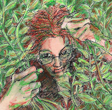
If I could only subtract all the messiness, then I'd be much happier with my pictures! New problem with the mask (beyond the smearing when I try to rub it off)--if you put it on too thick, it pulls the surface of the paper up with it when you try to take it off. Grrrrr. And then the blobs of ink splattering all over the place. I really need to do something about that too.
But this is a picture I made for my sweetie's birthday yesterday. I hope he likes it.

Amazing intricacy and I like the energy flow of it, too!
ReplyDeleteWow, the detail and intricacy is amazing!!!
ReplyDeleteLuckily you are the only one that sees those problems - we just get to enjoy the finished piece!
ReplyDeletefantastic....such an eerie atmosphere.
ReplyDeletehehe... it is our burden as artists to agonize over the details that in the end nobody else notices!
ReplyDeleteBeautiful madness in your lines!
Fantastic details
ReplyDeletewow! I love the detail on the man's sweater. It's like you can hear the song he's playing.
ReplyDeleteYes, I think we have good taste, too!
ReplyDeleteI really like your art. congratulations :)
ReplyDeleteThis is magnificent!
ReplyDeleteThis is so beautiful and fluid .... any "messiness" just adds to it - like notes escaping and floating away :)
ReplyDeleteI like the messiness. It gives texture and grit to the piece. And in this world of computer imagery, where something can be made perfect with a single keystroke, I like the imperfection of hand done work.
ReplyDeleteBrava, this is a lovely piece.
This is a really awesome work! The detail is awesome.
ReplyDeletewonderful illustration, great technique and full of soul
ReplyDeletegreat detail and texture!
ReplyDeletethanks for the visit.
I love the texture and the flow :)
ReplyDeleteThanks for the comment on my blog
what mask are you talking about?
I can only imagine he was more than pleased. This is rhapsody ;)
ReplyDeleteDivya--it's stuff kindof like rubber cement, only a lot thinner, that you paint on the paper to keep those parts of it white while you splatter or paint over the rest of it. Then you're supposed to be able to peel it off, leaving it white. But I guess I put it on too thick or something, because this time it peeled the paper up with it, in ugly unsmooth strips. You can't really tell in the scan, but in the original, it's pretty noticable.
ReplyDeleteAnd I agree that you always just have to "go with the flow" of whatever media you're using...but some of the messiness seems a bit much. Overall I'm pretty pleased, but still....
Thank you for your comments.
ReplyDeleteAnother great piece - despite your worries it looks wonderful! What a lovely gift!
ReplyDeleteWow! This is magnificent! I like it very much.
ReplyDelete