
So finally, here is my first project for my BEGINNING print-making class. Quite the beginner project, eh?

I guess I learned a lot from doing them, and I had to do two instead of just one. And I have some ideas for some more, but no....we've now moved on to collagraph. I disapprove of this a little of this here, a little of that there kind of class. It really takes me awhile to get into something, and to really see what I might be able to do with it, and then to do it.
So we'll see.....
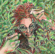
They are awesome. Lovely portraits and I love them in color!!
ReplyDeletexxx Marianne
I agree, these are wonderful. I like classes that skip around though. When I find a technique I like, I explore it on my own outside of class.
ReplyDeletethis is interesting, but personally I prefer less vivid=black&white prints. I think this technique goes better in B&W, the color can sometimes distract from attention , it is just as a photograph - I prefer monochrome portraits . Keep going on, I am wondering what you show us next!
ReplyDeletePrintmaking has always been such a wonderful form of art! Your portrait are absolutely wonderful! Thank you for stopping by my blog and allowing me the opportunity to find your lovely creations!!!
ReplyDeleteBeautiful! That blue one just blows me away. It's gorgeous.
ReplyDeletewunderbar, especially the blue one!
ReplyDeleteFantastic! I love your work!
ReplyDeleteThese are both great, and your first project too! I really like the movement (and is that Bob Dylan blowing in the wind in the second?). I did a bit of print-making in art college and my first attempts in color were totally dismal.
ReplyDelete