Thursday, November 29, 2012
Exercise in lights and darks
So I was reading James Gurney's book (sorry I can't remember the name) and he was talking about a painter (whose name I also don't remember) and a painting of a windmill, and how each of the blades of the windmill was handled differently--light on dark, dark on light, dark on dark, and light on light--and how interesting that is. So that's what this is all about. The guy is from a picture in our local newspaper (of a local college basketball player whose name I don't remember either--though one of my students recognized him and commented upon it when walking past my desk this morning). I made a couple little tonal sketches, and while working on this realized that I do a lot of this in my drawings anyway, but not usually all four. Getting the light on light was the hardest.
Oh, and here's a link to a page of Gurney's blog where he talks about this: http://gurneyjourney.blogspot.com/2012/11/bargue-study-of-seated-man.html
Friday, November 23, 2012
Illustration Friday: Zoom
Hey--I actually made an illustration for Illustration Friday. Okay, so I didn't manage to get it in before the topic changed, but since I'm not going to do a "whiskers" picture, I thought I'd post it anyway. Last week's topic was "zoom". This is large (or relatively large), 11 X 15 inches, and regardless of how it turned out, I am pleased, because I had an idea, made some sketches, and then executed it, all in one day. Actually, it's not the "all in one day" thing that I am pleased about, it's the planning. I'm usually not so good at planning.
P.S. The top half of this drawing is now inside the dog. The dog has an unnatural fondness for watercolor paper, and I was getting lax about leaving things around where he could get them. Darn.
Labels:
big pictures,
doodle,
Illustration Friday,
pen and ink
Wednesday, November 21, 2012
Tuesday, November 20, 2012
Sunday, November 11, 2012
The Last Tree
So this is the last tree (I think). This one is a real tree (though several of the others--most of the others--were loosely based on real trees), the hated Tree of Heaven behind my neighbor-across-the-alley's house. I'd actually like to do it again, in a different kind of medium. The gouache is really thick, and if I thin it, it doesn't resist the ink as well.
Labels:
gouache and ink,
Illustration Friday,
nature pictures,
trees
Saturday, November 10, 2012
Illustration Friday: Tree
I absolutely love trees. I can tell you, describe for you, every single tree that I've been able to see outside of every single place I have ever lived in my life--the row of 100 year old maple trees outside of my childhood bedroom window, the larch tree outside my dorm room window in college one year which I thought died in the fall, and I was so happy when it came back to life in the spring, the elm trees with their swirling yellow leaves in the fall in Minneapolis and the giant sweet gum tree that towered over the house across the street, and....I really could go on and on.
But I rarely draw trees from life. I'm not sure why. I think it's enough to just see them.
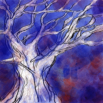
I often "doodle" trees though. The top one here is a tree I made on Corel Painter while talking on the phone. And the bottom one is one I made this afternoon with water soluable painting crayons, water color, pencil and India ink.
Actually, I had an idea about these, and, as I learned from doing (or rather, attempting to do) the 29 Faces in September challenge, making one of anything doesn't teach you a whole lot. You have to do a bunch. So I started a bunch, and here's the first one. The second one is drying, but I don't like it nearly so much.
Labels:
digital drawing,
Illustration Friday,
mixed media,
trees
Sunday, November 4, 2012
Old and New Projects
So an old project....making fairly quick sketches from pictures in the newspaper. "Skewed sketches", if you will, where the initial sketch is very quick and loose, and then you slow down to render it, as if those distortions were reality. I haven't done any in awhile, but they feel like good practice to me. I've noticed, though, that over time, they've gotten less and less "skewed." I wonder what's up with that. If you click on the "Skewed Sketches" tab on the right, you can see all of them, and see what I mean.....
And the new project--interiors--is something I've meant to tackle for a long time. I just draw people, and I feel very limited in that I have no idea how to draw the space AROUND the people. So I'm going to (I hope) practice drawing spaces. Interiors, in particular, since it's heading towards winter (though I won't believe that until I feel it).
So here's the first one, at a meeting, where I would have much preferred to simply draw the people (the kind kind people who have never objected to me drawing them during these monthly meetings). But no, I attempted the space, which is so much less interesting, but, I've decided, necessary.
Labels:
interiors,
pen and ink,
sketchbook,
skewed sketches,
wrinkles
Subscribe to:
Comments (Atom)


