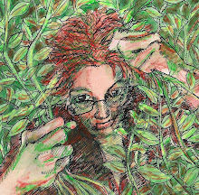
These have to be the most boring portraits in the world. I don't know why I keep doing them. Yes, I do. It's because I SEE really cool portraits, and I'd like to do something like them. This time, it was looking at Stephen T. Johnson's portraits from Time Magazine. I went to high school with him. We took drawing classes together. And he is an incredibly cool illustrator. Here's a link to those illustrations: http://www.stephentjohnson.com/artwork/category/commercial_work/
So this....alas....well......
But as far as "shiny" goes--this is textured paper for acrylic painting. It has a shiny surface, and it's so much fun how my pen glides over it....

Well, I'd say your pen did some mighty fine gliding on this one..and I disagree with you about them being boring. There's nothing boring about your line work!
ReplyDeleteI really like this portrait...it's intriguing but I can't really say exactly why. Perhaps because he has his eyes closed? I wonder what he's thinking about. It's amazing to me how you have shading and light done so well here too. It's impossible for me.
ReplyDeleteI forgot you were from Kansas too. I just posted a few photos from our camping trip to Toronto Lake...have you been there? It's gorgeous. The ticks are really bad right now though.
Have a great week!
This is great...AND NOT BORING!!!!...I looked at the link and agree...this guy does some good illos....but your's are just as good...just different style.
ReplyDelete