Wednesday, September 3, 2014
See my work here instead....
It looks like I'm not keeping up with this blog anymore. If you're interested in seeing my work, here's where I'm posting EVERYTHING: Kansas-Coreopsis. Here is the site with just my best work: https://theresamartindrawingsandprints.wordpress.com (this is the one I'd recommend).
Friday, June 20, 2014


The rest of June...Color Reduction prints
....this is for my mother, who never comments, but who nevertheless wants to see my work on her screen....


These are all three-color reduction linoprints. I had never imagined that I would get so into these. I'm not normally a "color" person, but I am fascinated by this technique, and am slowly learning how to do it.
At the moment, I am more interested in the marks than anything, and have started several more which I will post when I am done.
Monday, June 2, 2014


Sunday, June 1, 2014
Gouache resist and India ink
I was also making a lot of drawings with a gouache resist and India ink technique. Here are some of THOSE--wow, this kindof seems like a lot, but that's what I get for not posting for an entire month.


So what was I doing in May?
I guess I didn't post anything, but I was very busy. One thing I was doing was making color reduction linoprints.
Here they are:


Here they are:
Thursday, April 24, 2014
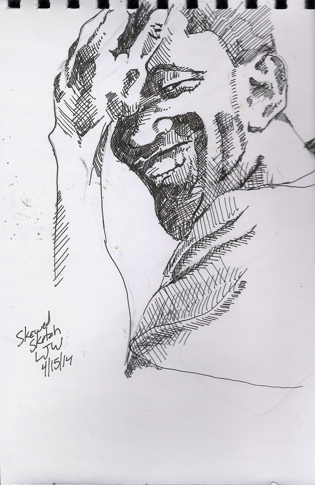
Drawings--upside down and skewed

These are my drawing practice (I'd say "warm-up" if I continued on with something else) that I can do in the middle of the day to help myself stay sane.

These first two were drawn with the reference photo upside down--a most excellent right-brain exercise (even though the whole right/left brain thing has been scientifically debunked).
The next two were essentially blind contour drawings, with pencil, that were then rendered as realistically as possible.

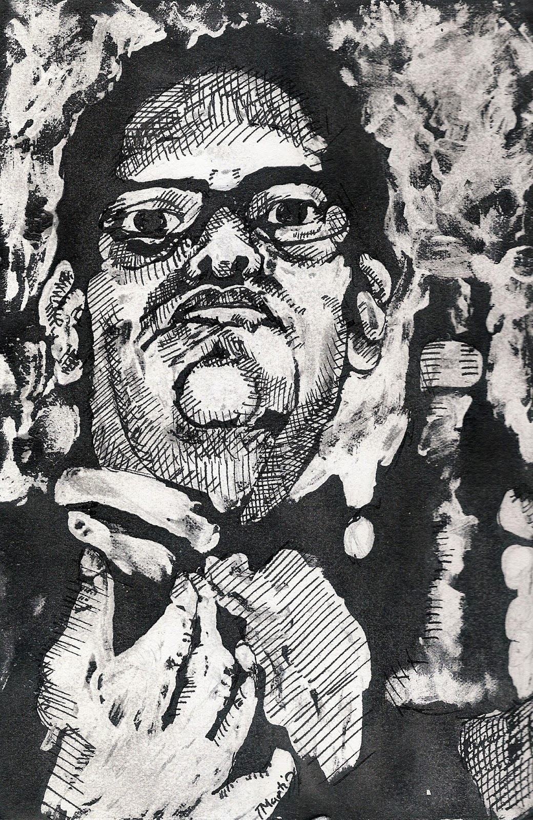
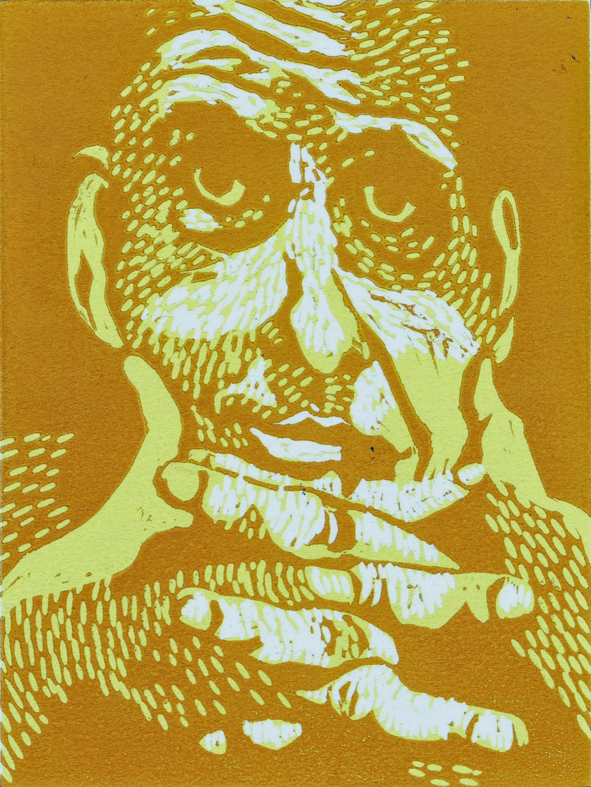
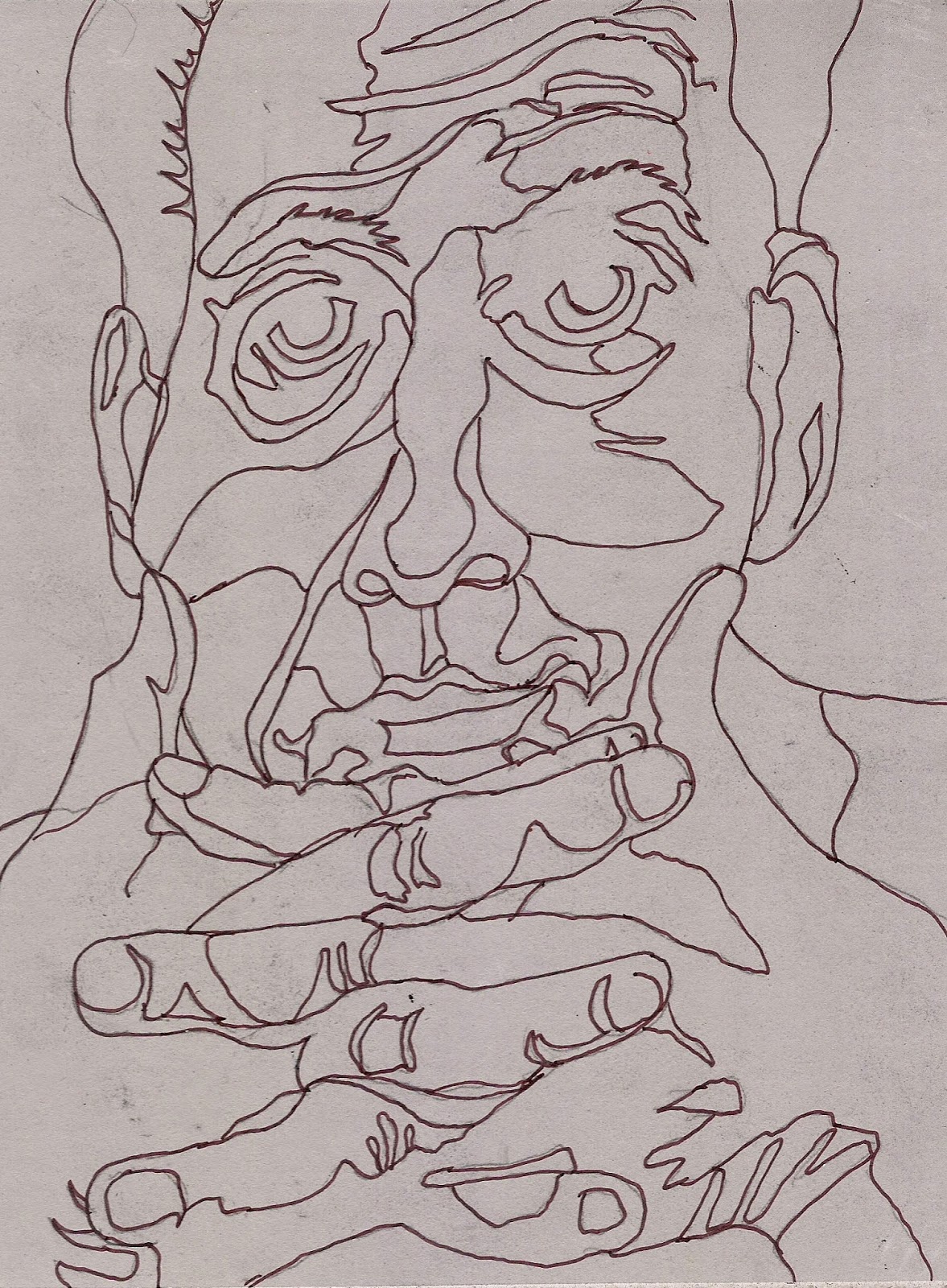
Dan

This is the last color reduction linoprint that I already prepared paper for, but I could always get more paper....
On this one, my goal was directional cutting marks to describe the cool patterns of his face, and I'm pretty pleased with it. It makes me happy.
My class has moved on to intaglio now, which is a process I adore, but my brain is still in reduction linocut mode (as it's been for the past month) and I'm not sure I'm ready to stop.....
Tuesday, April 15, 2014
Two more color reduction prints

I think I'm getting the process down. In this last one, I was going to stop after the dark green layer, because it looked really really cool with just the two greens, but I carved away for the black, and was going to print just one, to see what it looked like, and I'm really glad I did, because the black adds a lot of depth.

This one, my next-to-last one, I'm not so happy with. The red seems just TOO shocking. I'd almost like to do this design again, with some other colors, and also carving more texture into it. Maybe I will. I thought I was done with these, but maybe I'm not.....
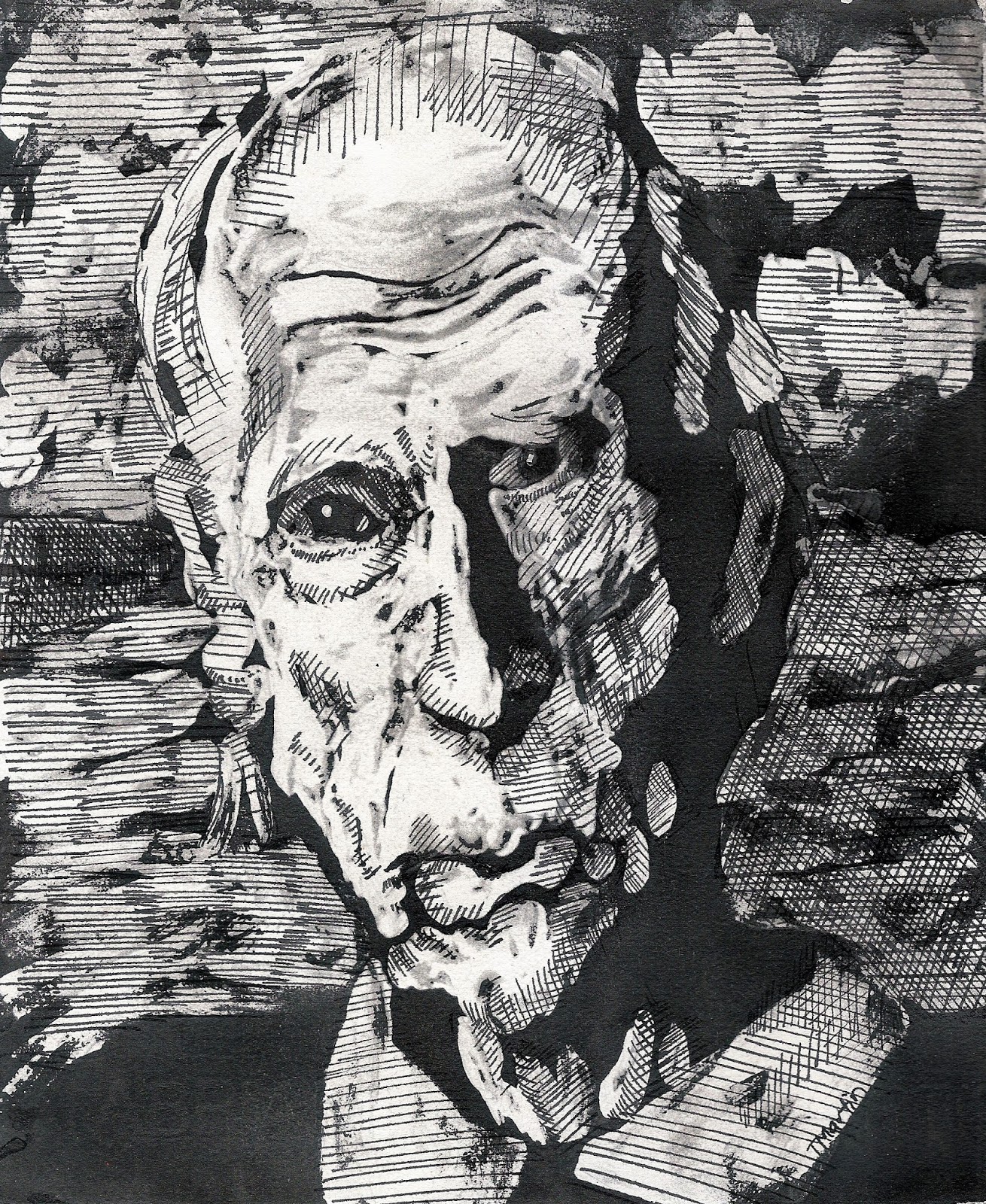
Sunday, April 6, 2014
Finished Three-color reduction linoprints
So here are the first two. I'm planning on doing more. I think I'll just use two colors, though, because that seems to be all that I can really process with my limited, basically black-and-white brain.


In both of these, the light yellow is too light, and basically doesn't contribute anything to the overall pictures.
And this one, I didn't like the dark that I started out with, so I only printed five of those, and for the rest, I carved a way a little more, and used a redder ink. I'm much happier with it this way.
Saturday, April 5, 2014
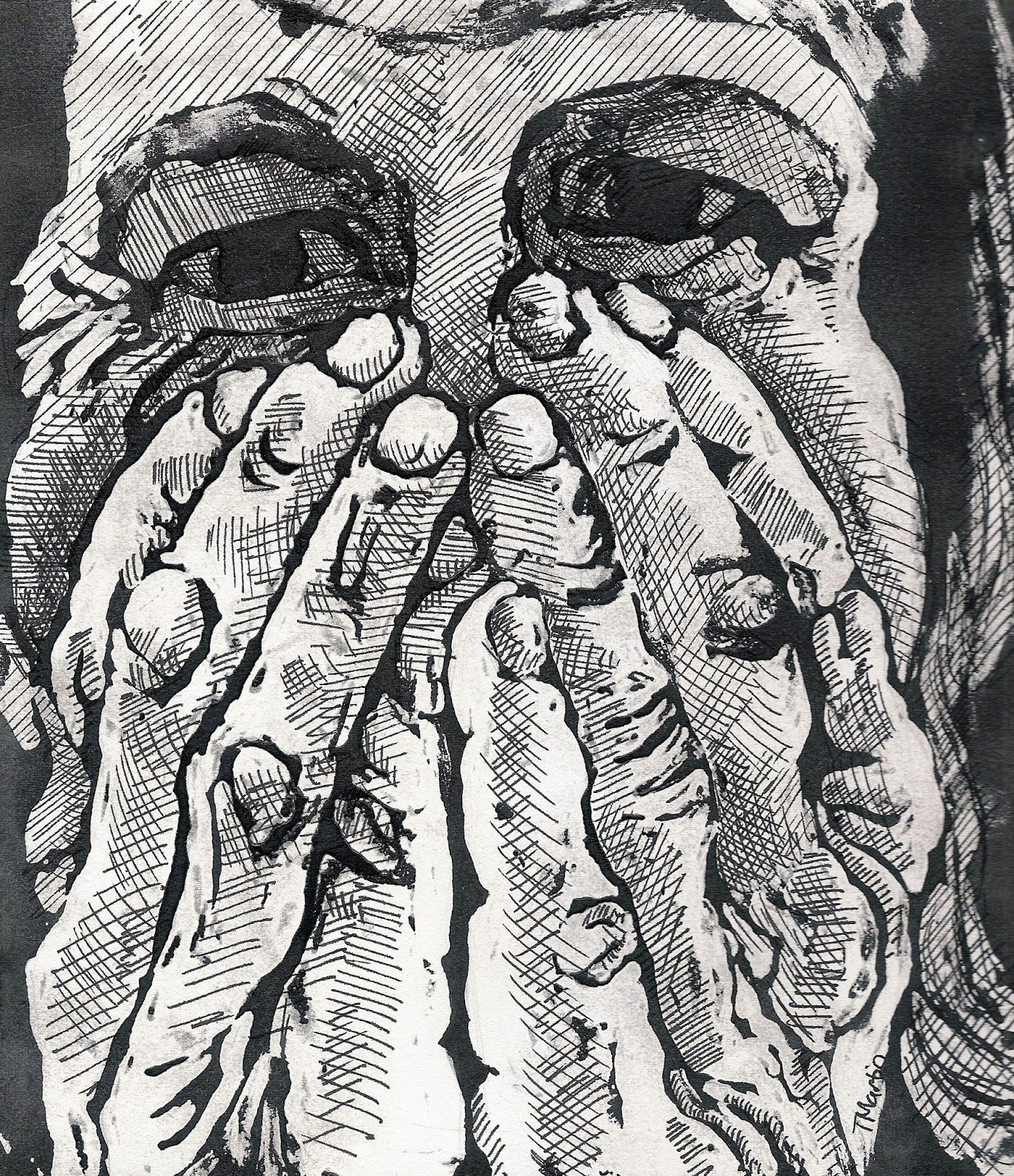
Intertwined Fingers
What a laborious project, and one in which you can't go back and fix something that you did earlier that didn't turn out to be the way you thought it would be....


Here's something like the final one, though I only printed five of them, and I'm thinking I may change this to a lighter color (like red) and then do some more carving, and have the dark areas much smaller for the rest. But I'm wishing I'd made some different decisions about the white--that those areas were larger.
Now we're going backwards. Here are the first two colors.
And here is the first color, the light yellow, and I have no idea why this ended up looking so dark..... I was really thinking about marks on this whole thing--wanting the marks to show for each color.
And here's the linoleum block, before I did any cutting.
Pay-it-Forward Art-Making Project for 2014

I promise to make a small work of art for the first five people who comment on this post and say "YES, I want in". A 'like' alone is not enough of a commitment, nor is a comment about thinking Pay It Forward is a great idea.
You must in turn post this as your status update and make something for the first five who comment on your status.
The rules are simple:
– It has to be your work, made by you, and the recipient must receive it before 2014 ends.
– It can be anything art-based: a drawing/illustration or a conceptual work of art, a photograph, a knitted item, cross-stitch, paper maché – or anything in between.
I'm paying this forward thanks to Jack Oudyn. Yes, you can be on each other's pay it forward lists.
First five, GO!
PS. It doesn't matter if you aren't an artist, try something out, google/ YouTube how to make stuff, step out of those boundaries.
Friday, March 28, 2014
More March gouache resist and ink

A return to this, one of my favorite mediums. It's a bit of a long process--draw, paint with gouache to resist the black ink, let dry thoroughly, wash over with India ink, let dry thoroughly, gently rub off gouache under warm running water, let dry thoroughly, and then finish with pen and ink.

But it's a process I love. I love the dramatic darks and lights, and the unpredictability of where and how the ink will go through the gouache, and the pen and ink lines. I love pen and ink!

I started these three (plus one more that I haven't finished yet) all at the same time, and then finished them as I had time.
Wednesday, March 26, 2014
More little March paintings
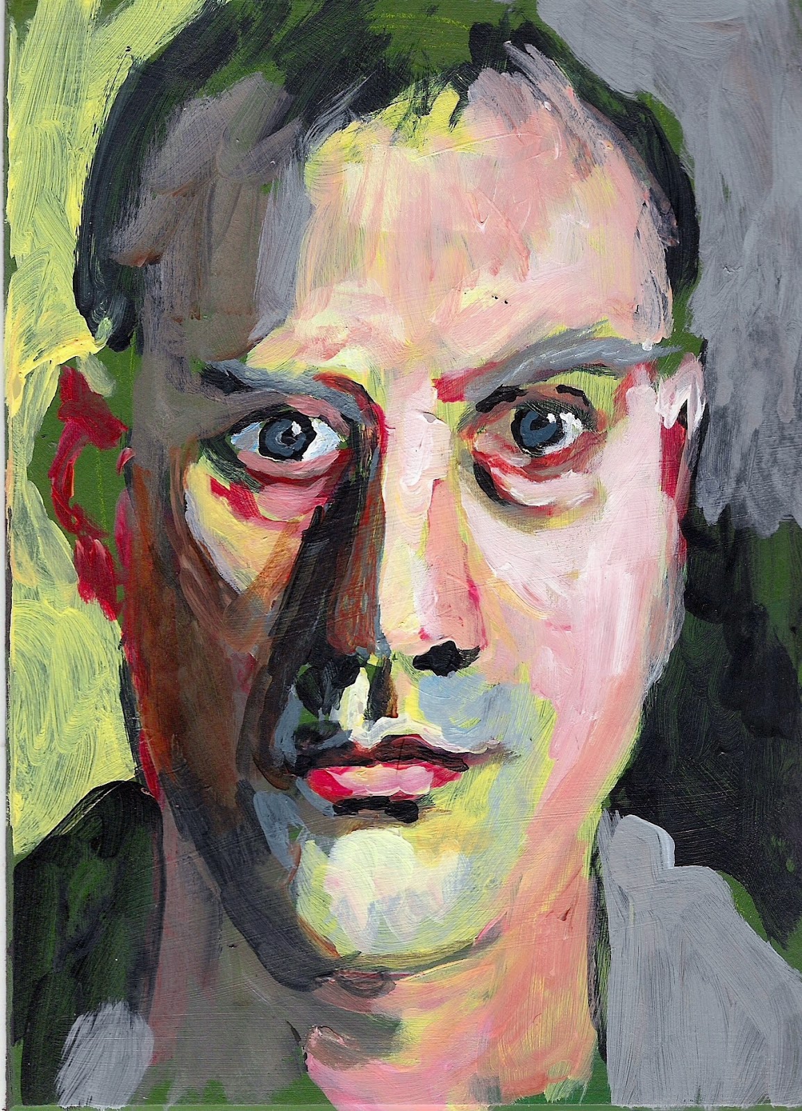
These little paintings (all are about 4 X 6 inches) are so crudely done, but I AM learning something about color.....

...which, in these paintings, is fairly hideous, but

I've taken away a few useful thoughts, which I can maybe put into practice in the future

(which means I should make some more of these really soon).
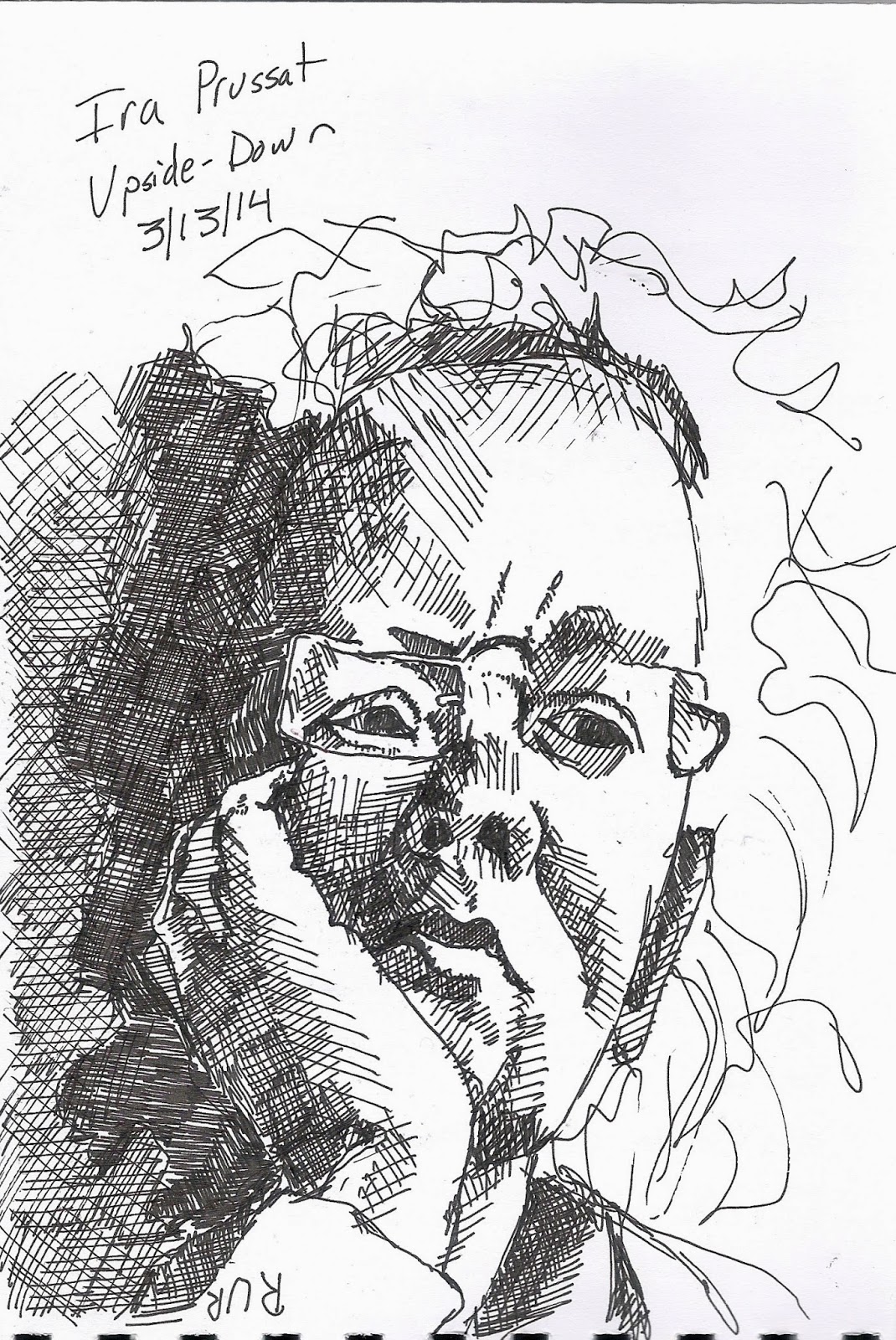
Friday, March 14, 2014
March Quick Drawings
So I've been inspired to try a new style of drawing. This is with a bamboo skewer dipped in India ink. It's so interesting how a new process prompts one to look at subjects in a new way.

Instead of looking for dramatic darks and lights (what I usually look for when I'm drawing), this technique makes me notice contours, because it's all about line.

And also, it's loose line. There's not a whole lot of control here, which means I can't be too tight, which is pretty liberating in itself.

And here are three of the not-loose, and not-bamboo-skewer-dipped, drawings, which really, is what I can do during the week of parent-teacher conferences at school, where I have twelve hour days.

They're pleasing too, but in a different way. All three of these were drawn with the reference photo upside-down, which also gets me to look in a different way.

When you're drawing upside-down, there is no "naming of the parts". It's all about shapes and direction and tone, because your brain can't "see" the parts that way. And this is good too...
Subscribe to:
Posts (Atom)